How can I show the grid on my map projection plots?
I would like to fill/shade a variable on a map projection, and I would like to illustrate my horizontal grid.
Question:
Once I've plotted my variable using a map projection, I want to draw lines or points to illustrate the grid. Can I make dots at the corners of the grid cells?
Solution:
A useful thing to overlay on a plot are lines or points to show the nature of the grid. The script mp_graticule.jnl can draw any set of lines on the plot. [For the default usage of mp_graticule.jnl, run the demo script mp_demo.jnl]
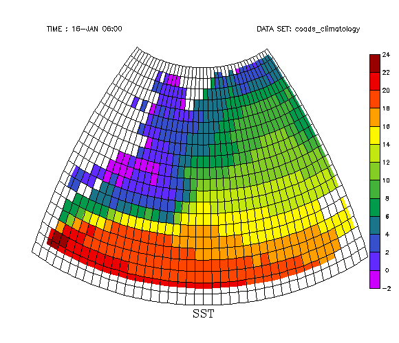
Here, we'll set up the script to draw lines at all the cell boundaries, and make a SHADE plot just to see how it looks.
yes? use coads_climatology
yes? set region/x=260:360/y=30:70
yes? set grid sst
yes? go mp_stereographic 320 45
yes? shade/noax/title=SST mp_mask*sst[l=1], x_page, y_page

yes? let xlo = `xboxlo[gx=sst,x=260]`
yes? let xhi = `xboxhi[gx=sst,x=360]`
yes? let dx = `xbox[gx=sst,x=1]` ! This assumes the original grid is regularly-spaced
yes? let ylo = `yboxlo[gy=sst,y=30]`
yes? let yhi = `yboxhi[gy=sst,y=70]`
yes? let dy = `ybox[gy=sst,y=1]`

yes? go mp_graticule `xlo` `xhi` `dx` `ylo` `yhi` `dy`
yes? ! One might want to adjust the exact ranges used.
Now, here is how to put symbols either at the cell centers or the boundaries. x_page and y_page are the coordinate locations of the variable translated onto the map projection. These variables are based on X and Y from the grid of the variable we're plotting. In the map projection scripts, there are always these commands:
let mp_x = x
let mp_y = y
where the X and Y are from the default grid (which is why we need to do the SET GRID command or run the script mp_grid.jnl for all map projection plots).
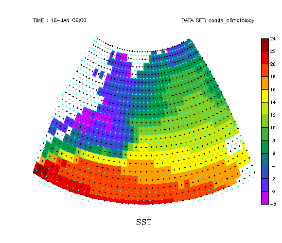
yes? use coads_climatology
yes? set region/x=260:360/y=30:70
yes? set grid sst
yes? go mp_stereographic 320 45
yes? shade/noax/title=SST mp_mask*sst[l=1], x_page, y_page

yes? plot/nolab/vs/over/sym=3 mp_mask*x_page, y_page

yes? ! These are the black symbols on the plot below the next section.
After setting the map projection variables, and executing the 3-argument SHADE or FILL command to draw the projected variable, we can redefine mp_x and mp_y to represent the box edges using the pseudo-variables xboxlo and yboxlo. Now when any of the map projection variables are used, they are still defined in terms of mp_x and mp_y, but these now refer to the edges of the grid cells of your original variable. Again, make sure to do this AFTER making the color plot of the variable. So, this command will put dots at the grid cell corners
yes? let mp_x = xboxlo
yes? let mp_y = yboxlo
yes? plot/nolab/vs/over/sym=3/color=lightblue mp_mask*x_page, y_page

yes? ! These are the blue symbols. Notice how they are at the corners of cells of color.
The image above was made with /SYM=3 on the plot/vs command so that the symbols would easily show up. For a nicer-looking plot, use /sym=dot. For instance, this plot has dots at the location of grid points. It was made running ferret in -gif mode.
yes? use coads_climatology
yes? set region/x=280:360/y=30:70
yes? set grid sst
yes? go mp_orthographic 320 45
yes? fill/noax/title=SST mp_mask*sst[l=1], x_page, y_page
yes? plot/nolab/vs/over/sym=dot mp_mask*x_page, y_page
yes? go mp_fland